All Seasons Holiday Park
The Family Friendly Park
Branding helps define a Mildura holiday park
The Challenge
All Seasons Holiday Park approached me in 2005 to assist them in rebranding their holiday park. We worked with their All Seasons Houseboats company and ensured the branding mirrored the Holiday Park. The old branding was dated and need updating.
The Solution
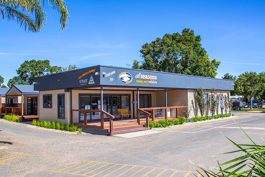
Having the foundation of the visual identity from the Houseboats, I was able to start implementation of the brand through the park. This include signage and other marketing collateral along with digital mediums.
The Deliverables
- Website
- Logo
- Signage
- Graphic Design
- Photography
- Video
The Process
Essentially the process of rolling out a good and consitent brand for the client has been over time. Each small project requires attention as its need. The important part is to refer to the branding manual and references for future projects to ensure the look and feel remains the same over a period of time.
The client have invested in a professional looking visual identity that increased the value of their business both as it compliments their amazing park and also attractions both visitors and customers which improving the overall asset of the park for potential future investors.
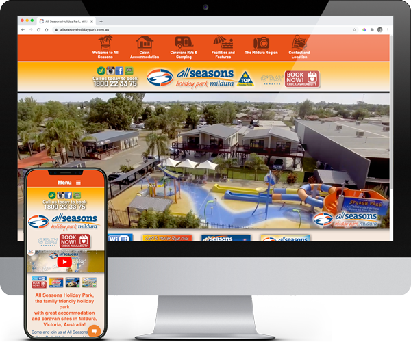
The Website
All Seasons Holiday Park logo
The concept for the logo was based on various needs. The logo utilises various elements of the client’s location in the semi-arid landscape of Mildura. Colours include blue for the sky and water, orange for the sands and sun and gold for the sunsets and sunrises. The logo has a slight nautical feel and typography utilises both casual and contemporary fonts. The logo and style have worked well since 2005 and established a strong presence in the marketplace.
All Seasons Holiday Park video
Over a period of years, I’ve been developing a series of walk through videos for each cabin in the park.
All Seasons Holiday Displays
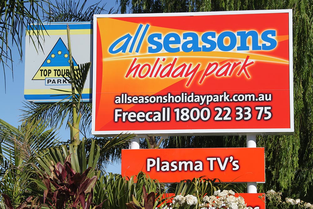
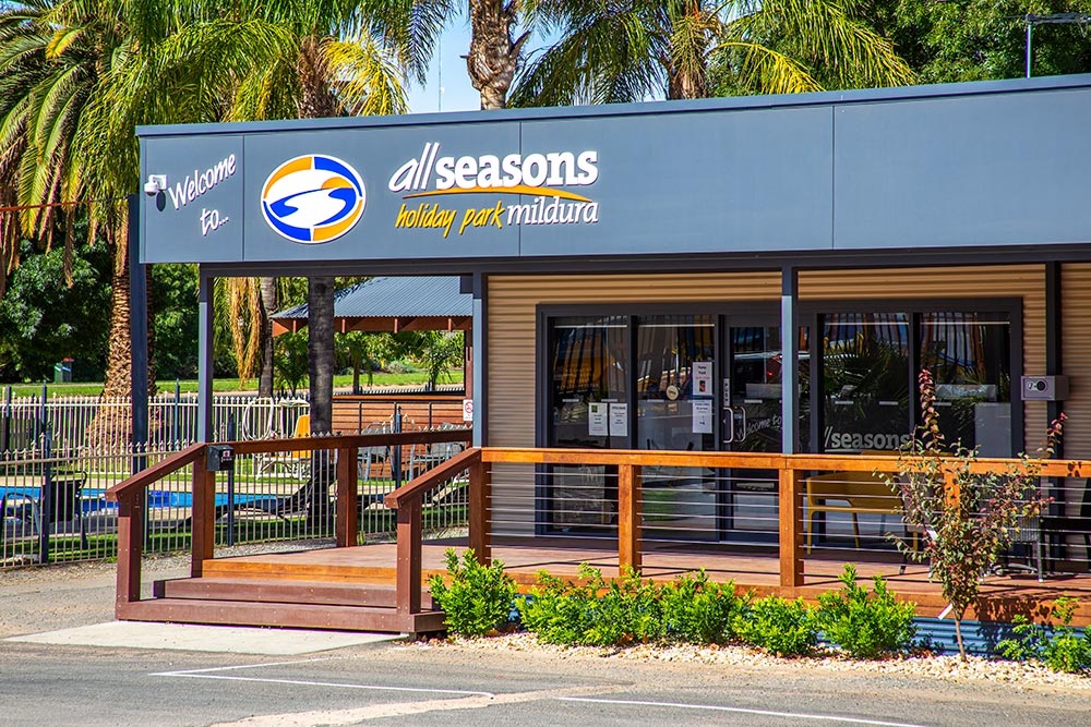
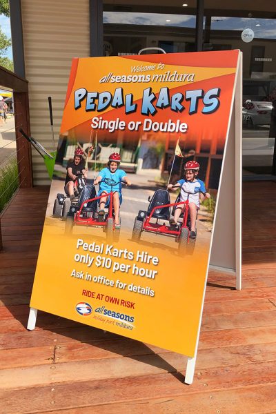
All Seasons Holiday Park signage
All Seasons Holiday Park Photography
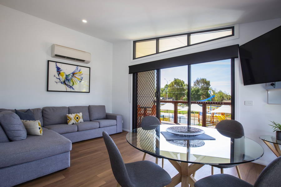
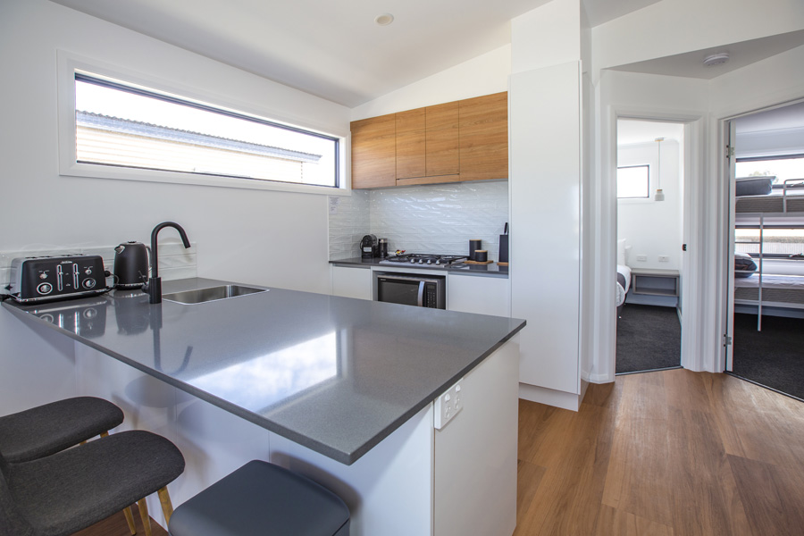
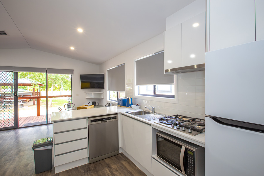
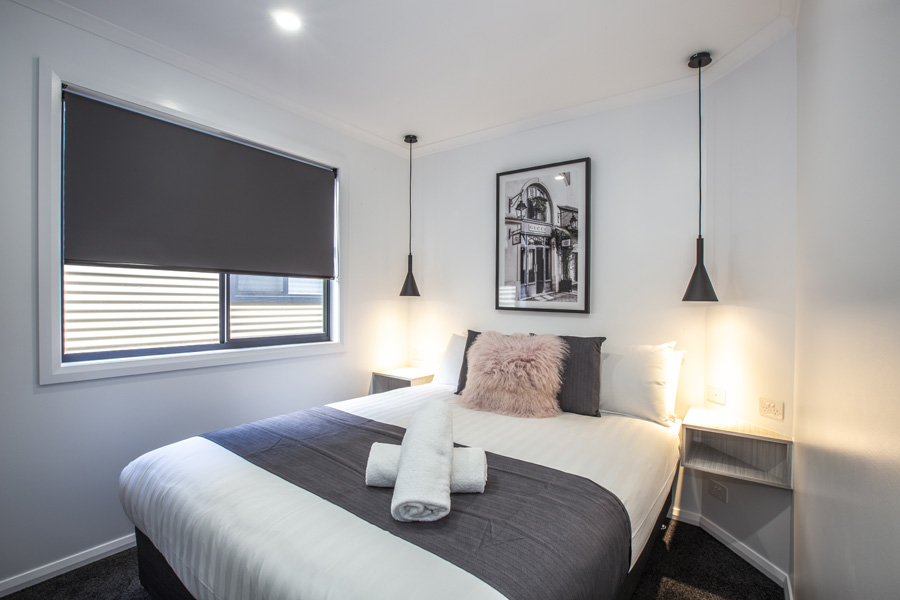
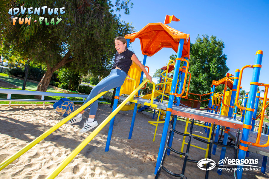
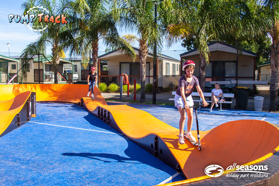
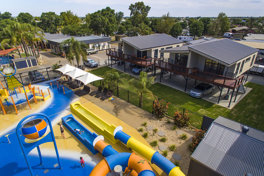
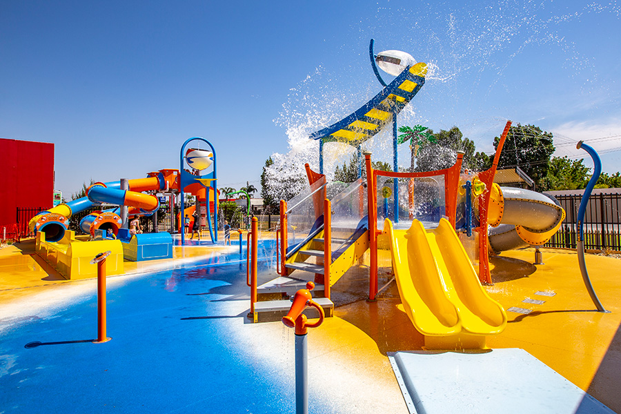
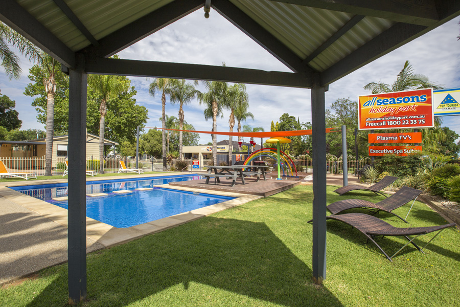
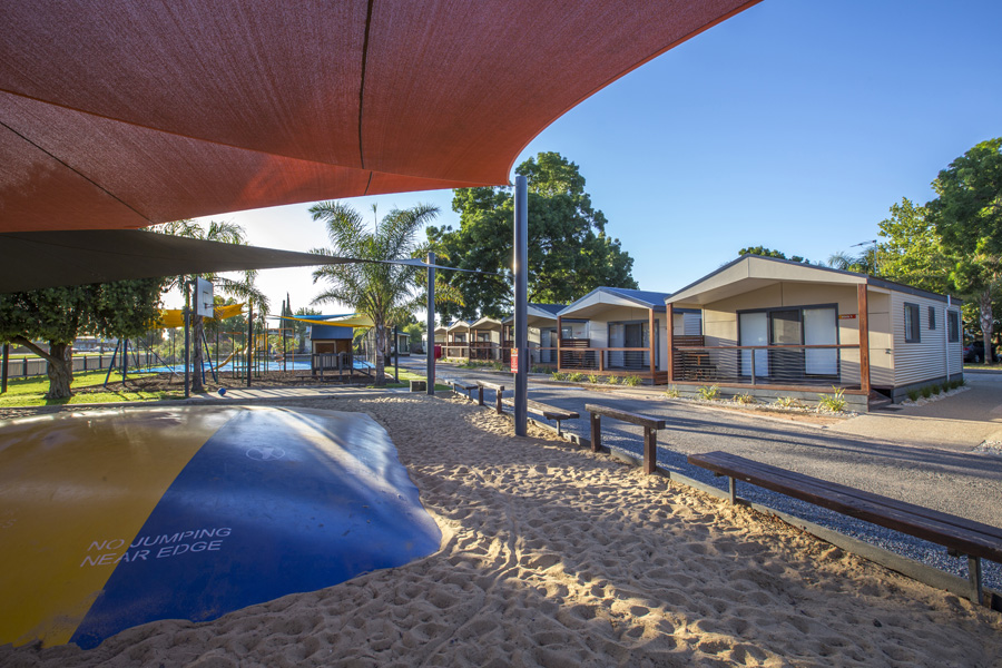
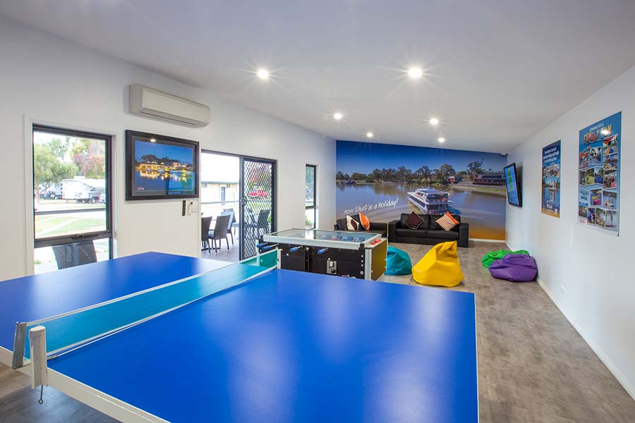
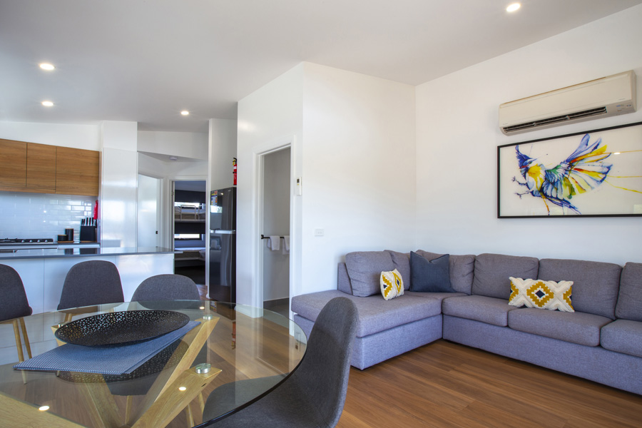
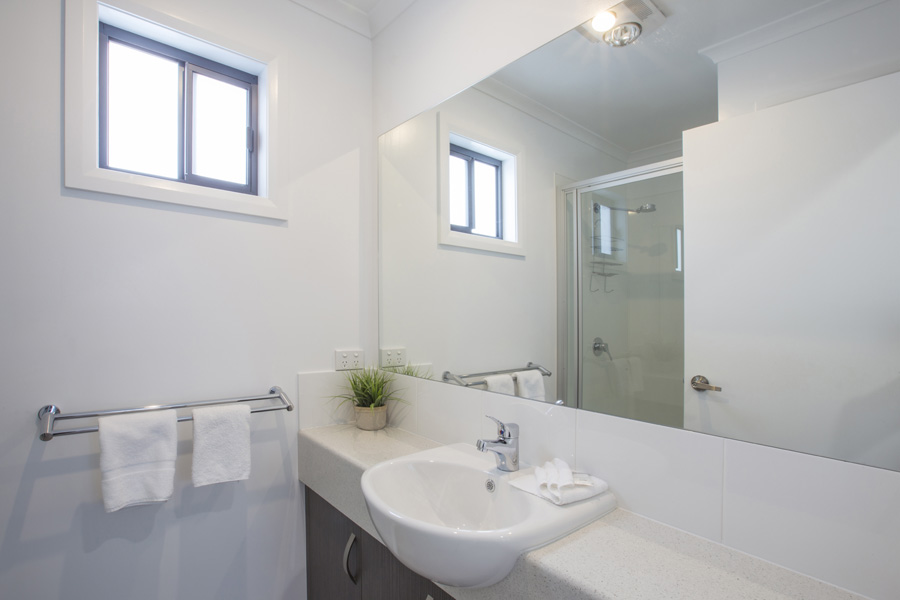
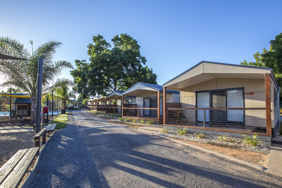
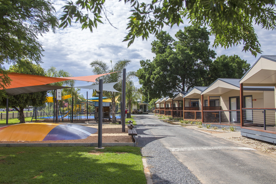
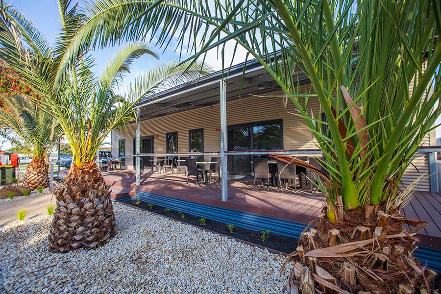
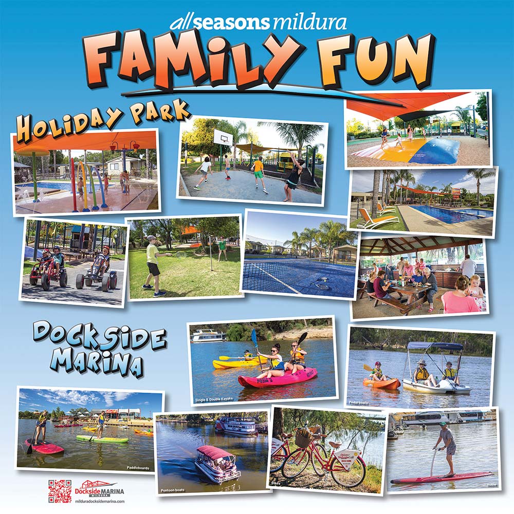
Working with All Seasons Holiday Park over many years has seen a diverse range of photography of their amazing park and accommodation. The holiday park photo shoots are designed to show the product off in the best light for customers to get a genuine sense of the quality of the park and experience. Shooting the holiday park keeps the brand consistent for customers expectations of quality and consistency.
Toilet Signs
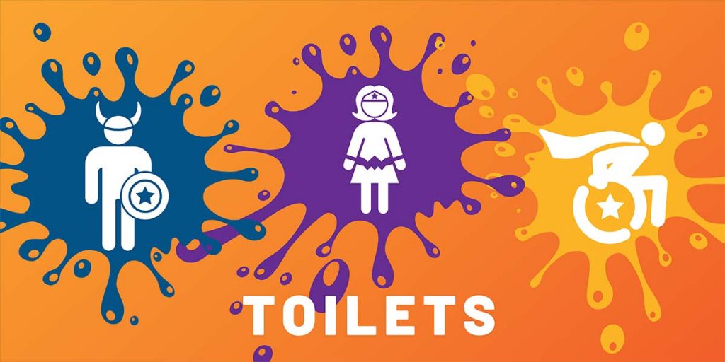
I designed these toilet signs as part of the Splash Park for All Seasons. We agreed the signs had to be fun and have a theme. I’d suggested rather than normal toilet symbols to create superhero characters for children to relate to and feel great about themselves. The colours are in fitting with the park’s overall visual identity and work great.
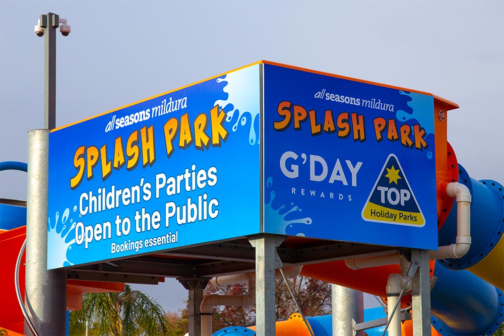
Splash Park signs
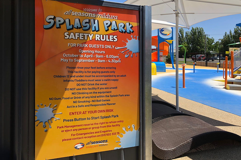
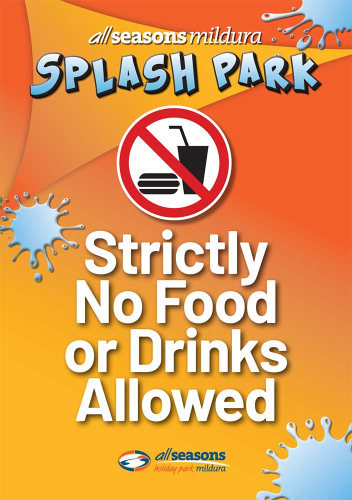
I’d designed a range of signs for the All Seasons Holiday Park Splash Park. One example is this food and drink sign. Keeping the signs with visual identity that has been established through the park keeps the business looking professional. Colours, shapes and text are used consistently across the park.
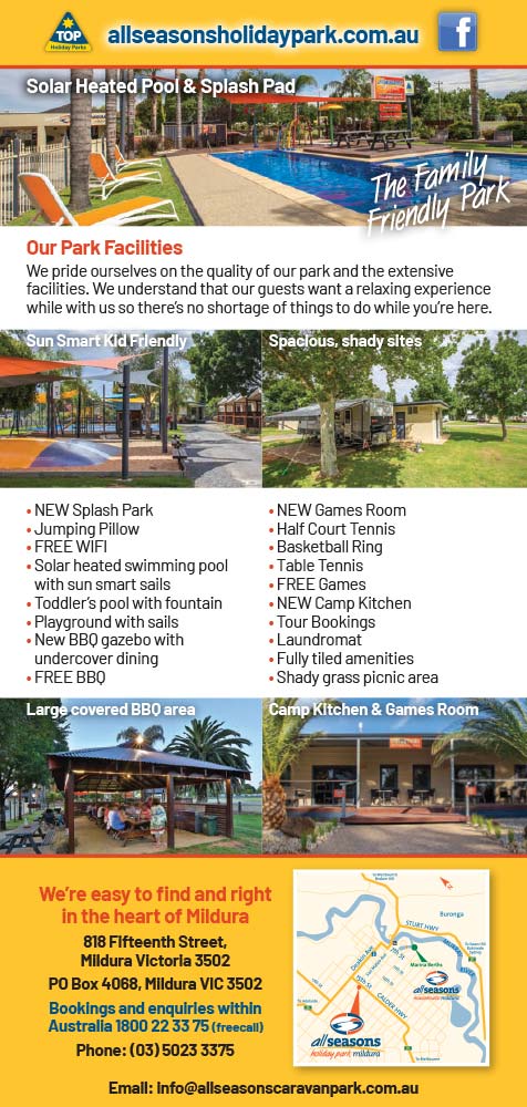
All Seasons Holiday Park DL Flyer
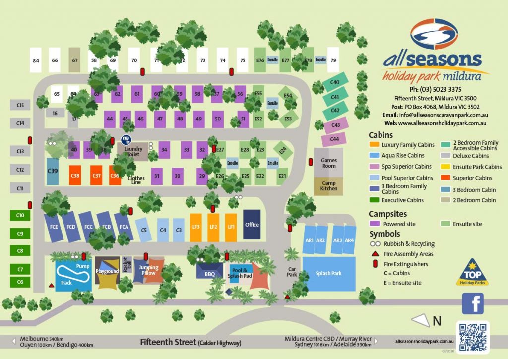
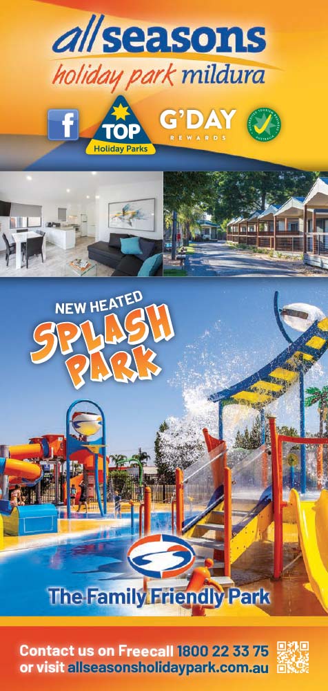
The design of the DL flyer was a modification of the existing A4 flyer. With the changes in internet accessibility for customers, this flyer was a focus on core information for the customer, great visuals and information that was a call to action. A limited run were printed and distributed to the local visitor centre. The flyer incorporated a small map and use of QR code for ease of access for customers on their phones.
Zesty Projects that create success
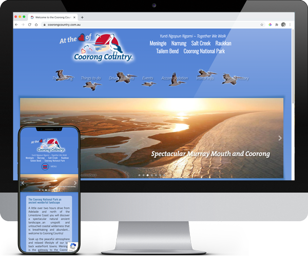
Coorong Country Branding
The Coorong and Meningie region used to be a lost landscape of natural beauty, history and indigenous culture. Developing the Coorong Country brand and supporting the local community has been very rewarding More >
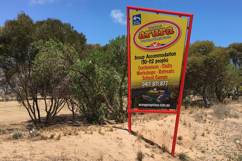
Arura Group Stays Branding
Arura approached me for a rebranding of their accommodation business. Formerly Port Hughes Accommodation Centre we rebranded the name to have more character and many other elements. More >
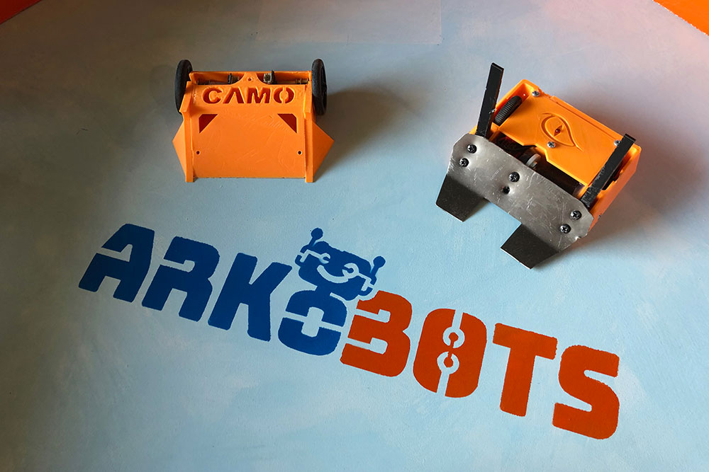
ARKObots Branding
As a start up ARKObots branding is pitched at the education sector. Fun colours with some stability that shows joy and a modern style. The brand icon allows for diverse application. More >
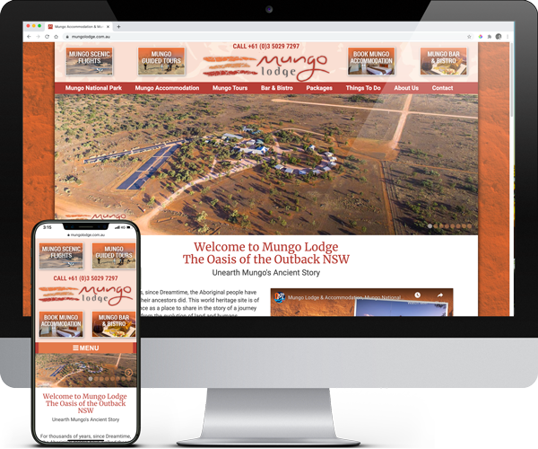
Mungo Lodge & Tours Branding
Mungo Lodge approached me to rebrand their business. This included full re-design, new byline ‘Unearth Mungo Ancient Story’ and brought everything together to tell their unique story of the outback lodge. More >
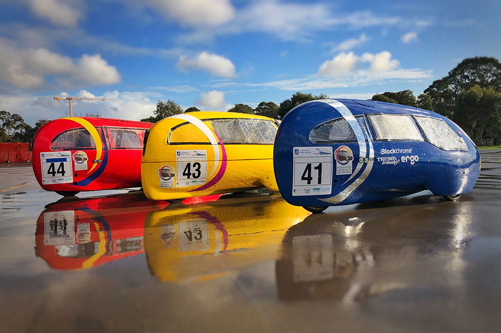
Norwood Morialta Pedal Prix Branding
The pedal prix team at Norwood Morialta High School had an opportunity to use pedal prix to promote the school and improve its image on the track. I developed a brand strategy to take implement the branding. More >
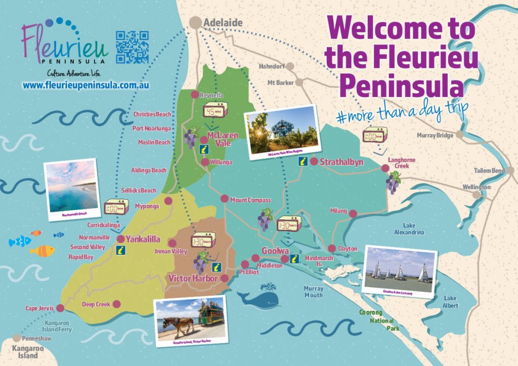
Fleurieu Penisula Tourism Maps
Once I’d worked through the current brand needs of the client we started developing different visual identity elements from both offline to online that aimed to continually build the tourism presence in the region. More >
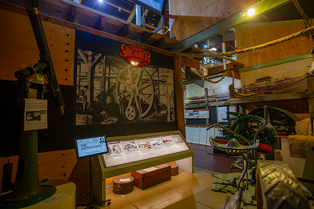
Mannum Museum and Mannum Township
Working with the Mannum Dock Museum of River History and the Mannum community has been very enjoyable. The museum is the heart of tourism in Mannum and is continually working towards improving its presence for visitors. More >
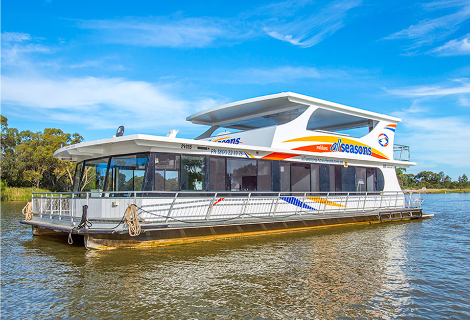
All Seasons Houseboats & Holiday Park Branding
Overseeing the successful brand development for All Seasons Houseboats and Holiday Park in Mildura. More >
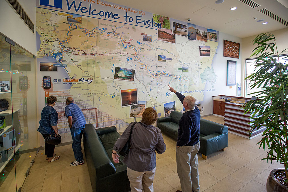
Discover Murray River Branding
Development of a diverse range of visual identity elements from both offline to online that aimed to continually build Discover Murray River’s presence in the region. More >
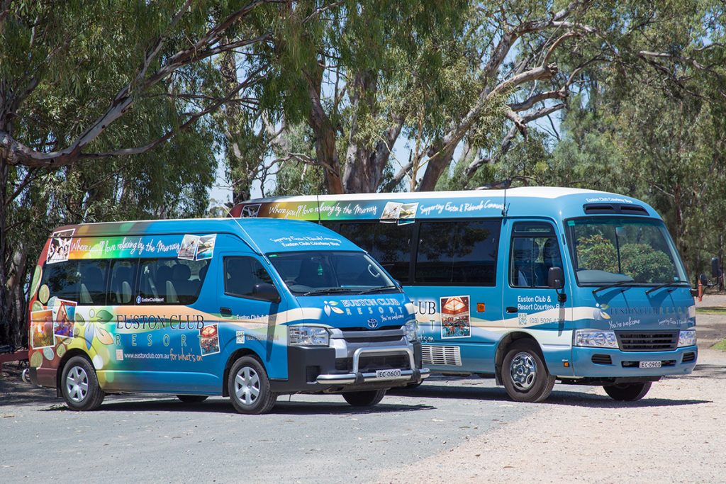
Euston Club Resort Branding
I worked through the club’s brand needs and we started developing different visual identity elements from both offline to online that aimed to continually build the club’s presence in the region and beyond! More >
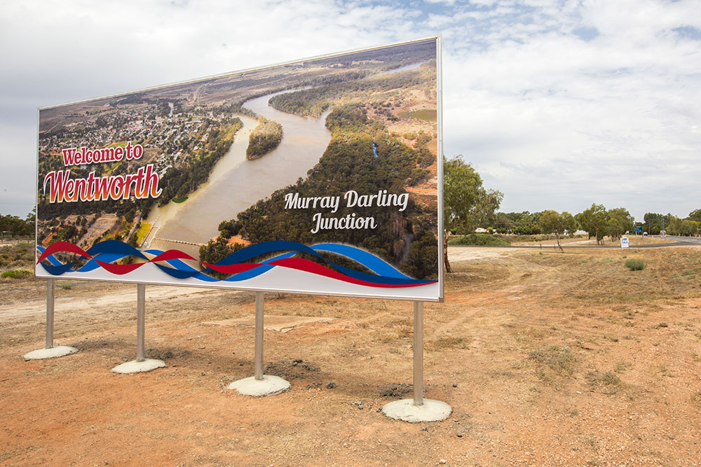
Visit Wentworth Tourism Branding
This tourism marketing strategy was built on 10 core principles. The brand worked for the Shire, community and industry. A brand that can be used across the entire region and a defined point of difference. More >


